Plain terracotta pots are perfectly fine. But they’re also a bit… same-y. 🪴
Once you start painting them, though, everything changes. Suddenly you’ve got pots that actually match your style – bold colours, subtle patterns, quirky designs, whatever you fancy. And unlike buying decorative planters (which can cost a surprising amount), painted pots cost almost nothing. Just the price of a few sample pots of paint, really.
The best part is you don’t need to be artistic. Some of the most effective designs are the simplest – colour blocking, dipped bases, basic geometric shapes. If you can hold a brush, you can do this.
We’ve pulled together a bunch of plant pot painting ideas to get you inspired, from quick beginner-friendly projects to more detailed designs if you want to get fancy. It’s a satisfying afternoon activity, and you end up with something you’ll actually use. 🎨
Let’s get into it.
1. Fruit Designs Are Having a Moment — and They’re Easier Than They Look

Watermelon is one of those designs that looks like it requires real skill but actually doesn’t. A pink base, a green stripe near the rim, a few black seed marks — that’s genuinely it. The bold, graphic simplicity is exactly what makes it work.
The smaller flower pot here shows you can go two completely different directions with adjacent pots and have them still feel cohesive. They’re both cheerful, both hand-painted, and both clearly made rather than bought. That handmade quality is the whole point — it’s visible in every brushstroke.
2. Mountain Scenes Painted on Pots — the Outdoorsy Shelf Aesthetic
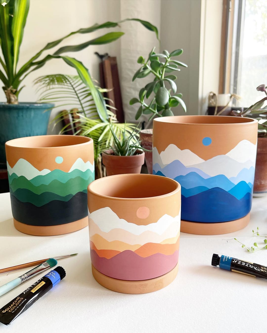
Simple silhouette landscapes — mountains, treelines, horizon scenes — have become one of the most popular pot painting approaches because they suit almost any interior. Earthy terracotta, a clean background colour, and a few brushstrokes of a mountain range in sunset tones. That’s an afternoon project with a genuinely lovely result.
What makes a set of pots like this work so well on a shelf is the consistent design language. Different sizes, same theme, same colour palette. You don’t need to paint the same scene on each one — just keep the style and colours in conversation with each other.
3. Geometric Patterns Are the Beginner’s Best Friend
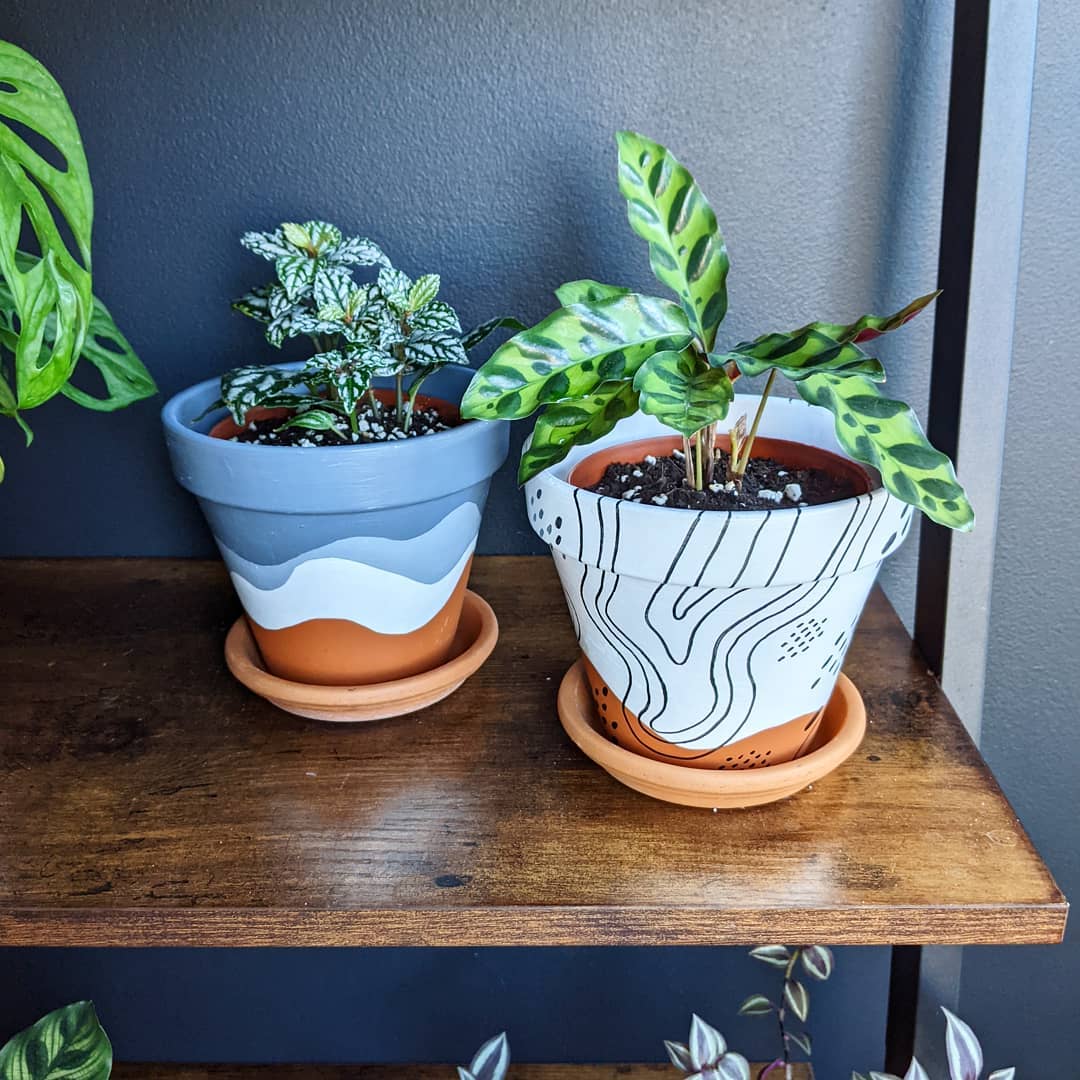
Wavy lines and geometric shapes are genuinely forgiving to paint because slight imperfections just add to the handmade feel. The grey and white wave pattern on the left is calm and tactile — the kind of pot that looks good with almost any plant and in almost any room.
The black-line-on-white approach on the right is a different energy entirely — graphic, confident, almost like a botanical illustration. Together they prove that you don’t need to match pots exactly for them to look considered when placed side by side. Contrasting styles can work beautifully as long as the plants tie everything together.
4. White Paint on Terracotta — Simple, Striking, Takes Ten Minutes
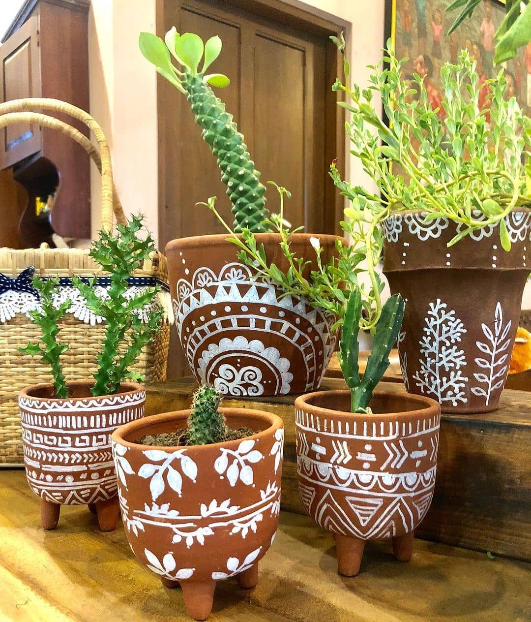
If you only try one pot painting technique, make it this one. White designs on natural terracotta — whether that’s leaf motifs, geometric shapes, or simple lines — look genuinely lovely without requiring much skill or time. The warm orange of the terracotta and the clean white paint do all the visual work for you.
Succulents and cacti planted inside lean into the earthy, artisanal vibe perfectly. These aren’t pots that are trying to be anything other than what they are — handmade, slightly rustic, full of character. The kind of thing you could sell at a craft market and people would be delighted to buy.
5. Give Your Pot a Face — the Weirder the Better
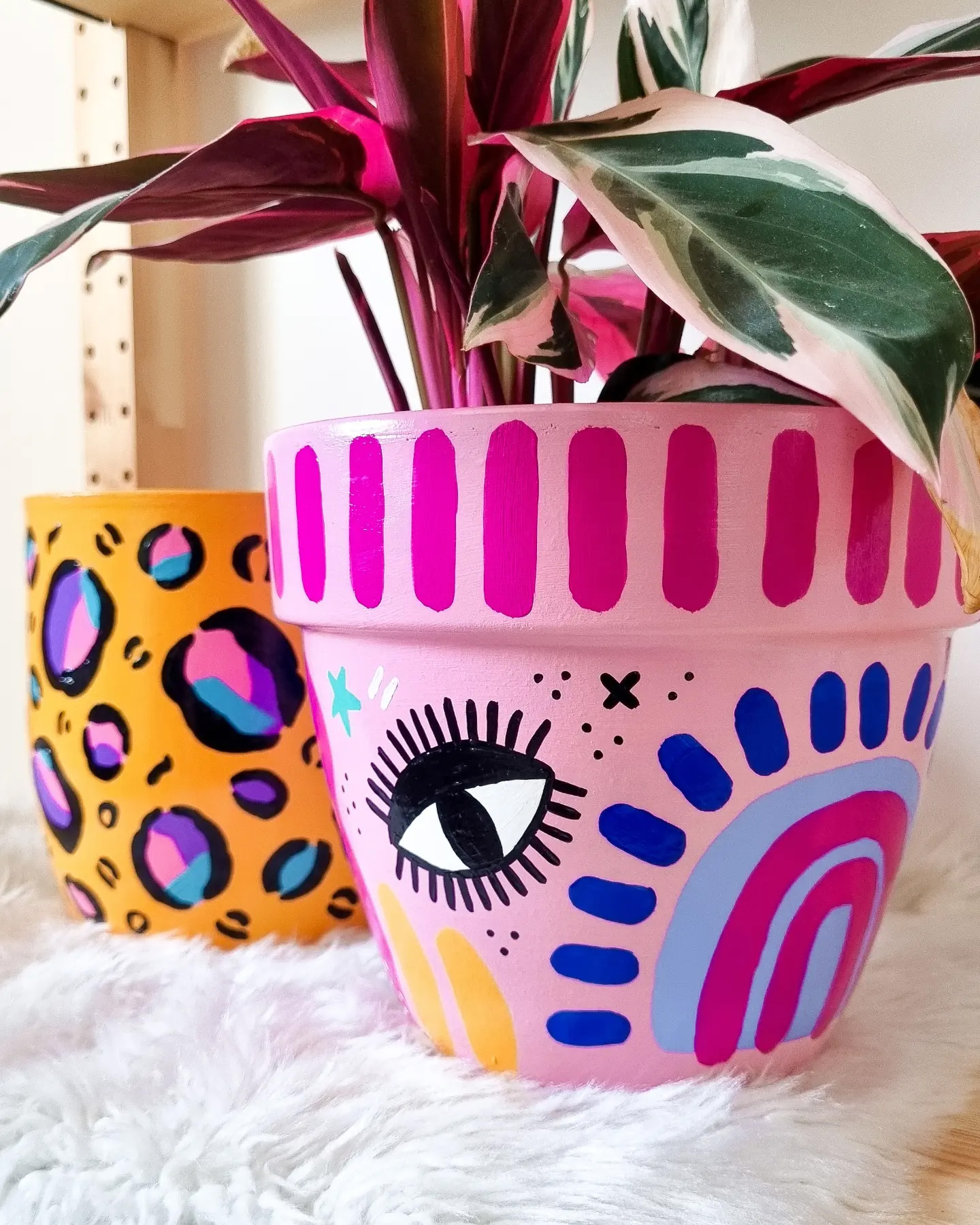
There’s a whole subculture of painted pots with faces, and this one — bold eyes, vivid pink, maximum personality — captures exactly why it works. The plant growing out of the top becomes the hair. It’s playful in a way that most home decor refuses to be, and that’s the whole appeal.
The orange pot with polka dots in the background shows how a much simpler approach can sit alongside something more complex without either feeling out of place. The common thread is joy — pots painted to make you smile rather than impress anyone.
6. A Checked Pattern With Cherry Details — Cottagecore Done Right
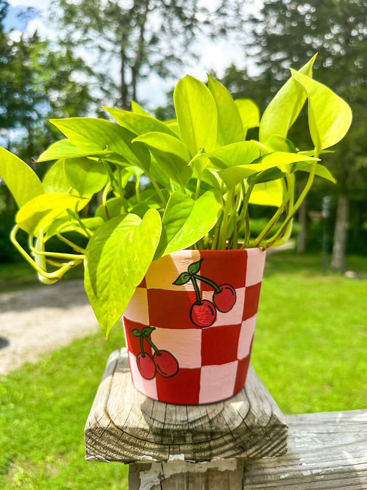
Gingham and fruit motifs have found their way into almost every corner of home decor, and it turns out they look brilliant on terracotta too. The red and pink checkered pattern here with its cherry embellishments has a vintage charm that feels genuinely considered rather than trend-chasing.
This kind of design works because it’s bold enough to read from a distance but detailed enough to reward a closer look. The yellow plant inside provides a colour hit that ties the whole thing together. If you fancy this style, masking tape makes the checked lines far easier to achieve — no ruler required.
7. Painting Starry Night on a Pot Is Easier Than You Think
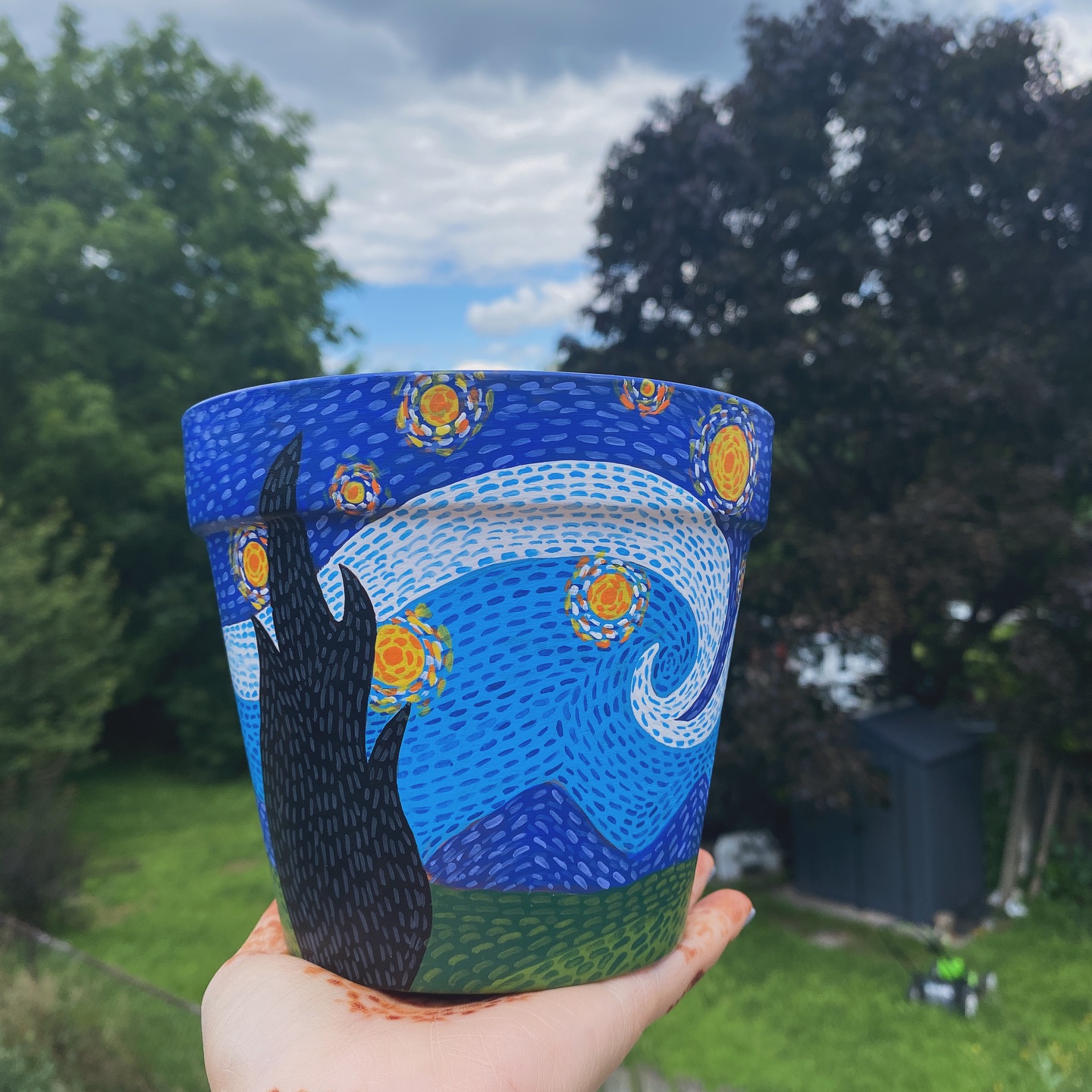
Recreating a famous painting on a pot sounds intimidating until you realise you’re working at small scale with forgiving materials, and nobody expects perfection. The swirling blues and yellows of this Van Gogh-inspired design capture the spirit of the painting without needing to nail every detail — and the result is something genuinely striking in a garden setting.
The approach here is alla prima — wet into wet, swirled together — which is actually easier than trying to be precise. Start with a dark blue base, work in lighter blues and whites, add the yellow swirls last. It’s the kind of project that looks impressive but takes less time than you’d expect.
8. Space and Aliens — the Pot Design Kids Actually Want to Make
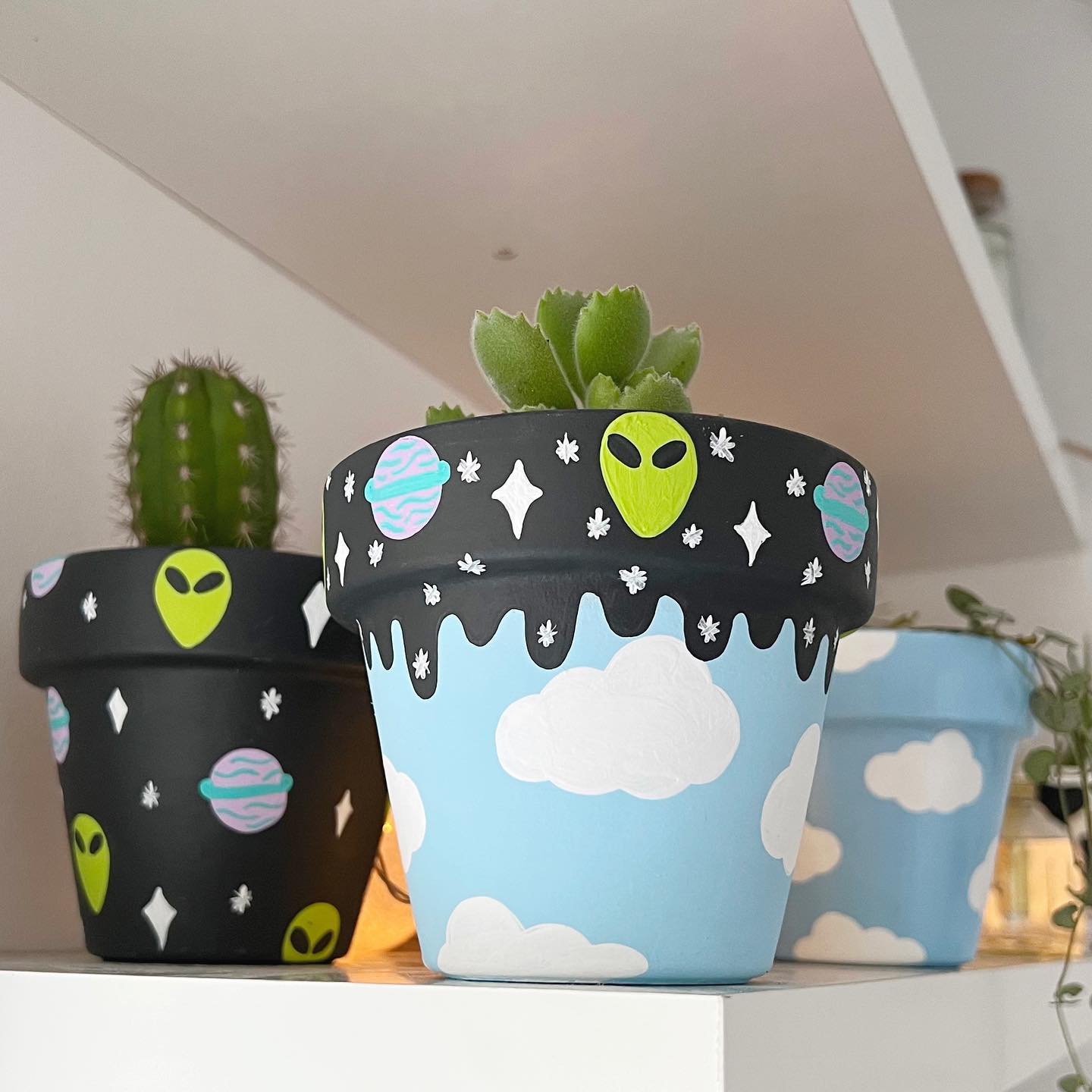
Black background, lime green alien faces, pink planets and white clouds — these are pots that a ten-year-old would be proud of and an adult would genuinely keep on a shelf. The cosmic design with its deep space background makes even small terracotta pots feel dramatic, and the contrast between the bold graphics and whatever plant grows inside is always going to be interesting.
This is the perfect rainy afternoon project with kids. The black base coat does a lot of the heavy lifting, and once that’s down, anything painted on top pops. No precision required — this style actively benefits from a loose, freehand approach.
9. A Black Pot With Pink Hearts — Minimal Effort, Maximum Charm
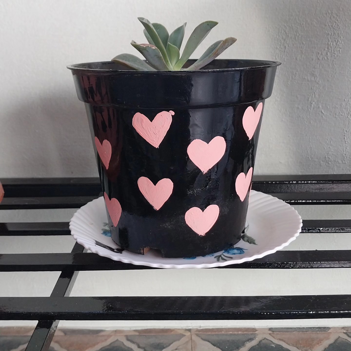
Sometimes the most effective pot painting ideas are also the most straightforward. A matte black base coat — one of the most flattering backgrounds for any plant — and a scattering of hand-painted pink hearts in different sizes. That’s genuinely all this is, and it works beautifully.
The contrast between the dark pot and the bright succulent inside feels intentional and considered. This is worth keeping in mind when you’re choosing your design — the plant is part of the finished picture. A bold dark pot with a vivid green plant is a complete composition, not just a container.
10. Cartoon Faces Turn Plant Pots Into Characters
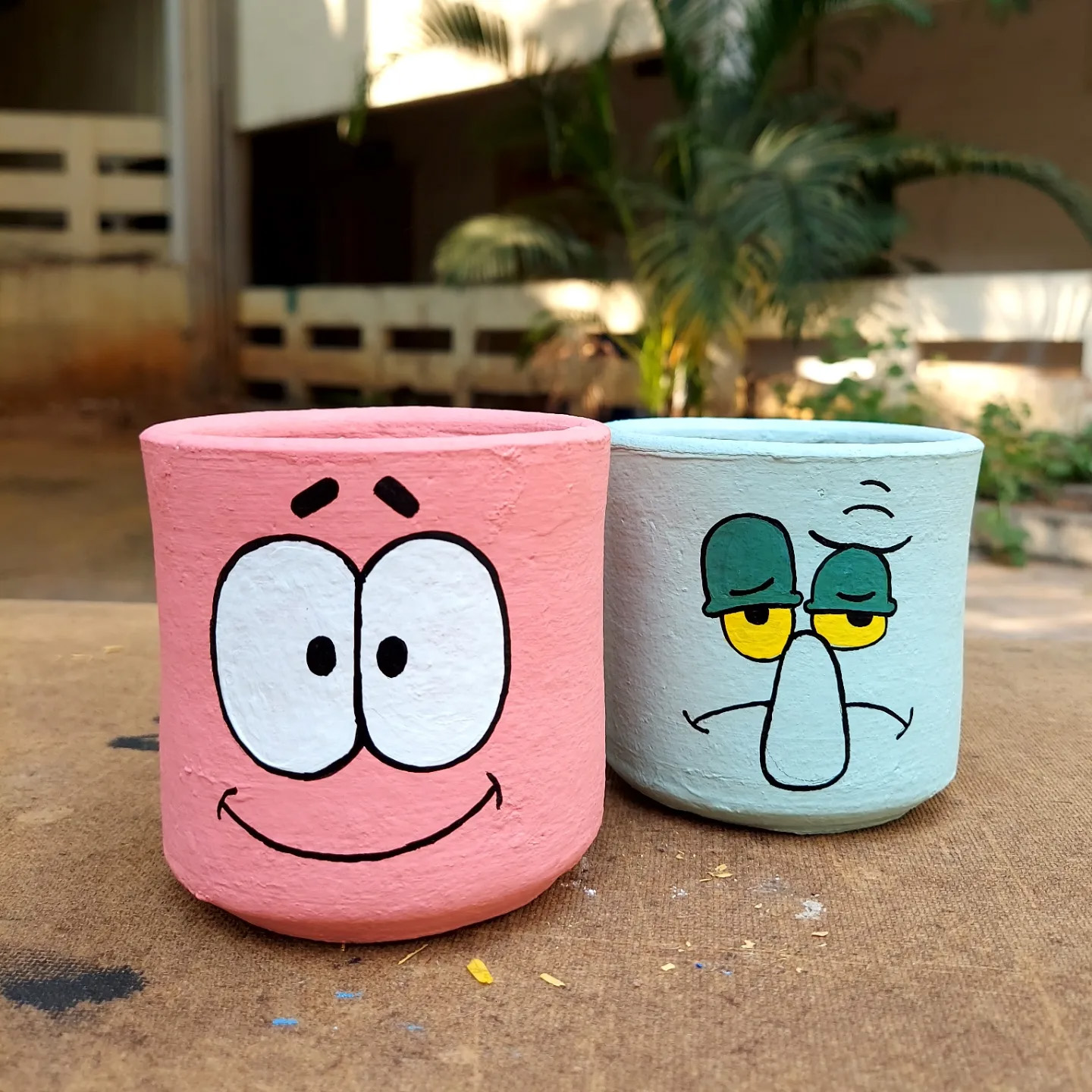
Once you start painting faces on pots, the plant becomes the hair and the whole thing becomes a small drama on your windowsill. These two — one cheerful and wide-eyed, one cool and skeptical — have proper personalities, which is a genuinely funny thing to achieve with a pot of paint and a terracotta planter.
Hand-painted cartoon faces don’t require any artistic training, just a willingness to commit. Start with simple closed or open eyes, add eyebrows for expression, and let the plant do the rest. The more character you give the face, the better it works.
11. Painted Portraits on Pots — Ambitious But Absolutely Worth It
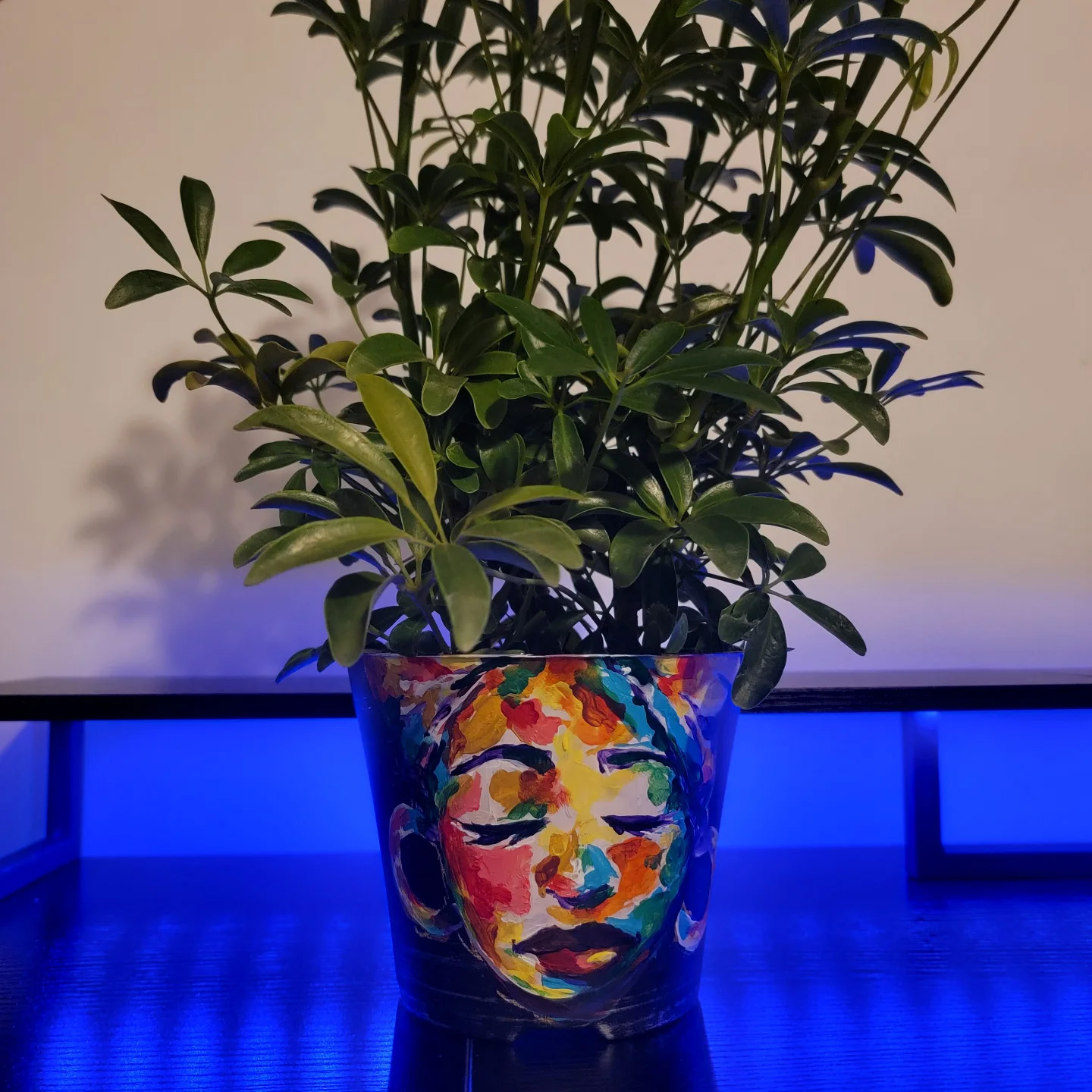
This is the more ambitious end of pot painting — a full painted face with colour and detail, more art project than craft afternoon. But the result speaks for itself. The serene expression, the bold colour work, the way the foliage frames it from above — it’s a proper statement piece that happens to also be a plant pot.
If this level of detail appeals to you, the key is building up in layers. Sketch the face lightly in pencil first, block in the base colours, then add the detail work once each layer is dry. Acrylic paint on terracotta is very forgiving — mistakes can be painted over easily.
12. Abstract Brush Marks on a Pink Base — Looks Expensive, Costs Nothing
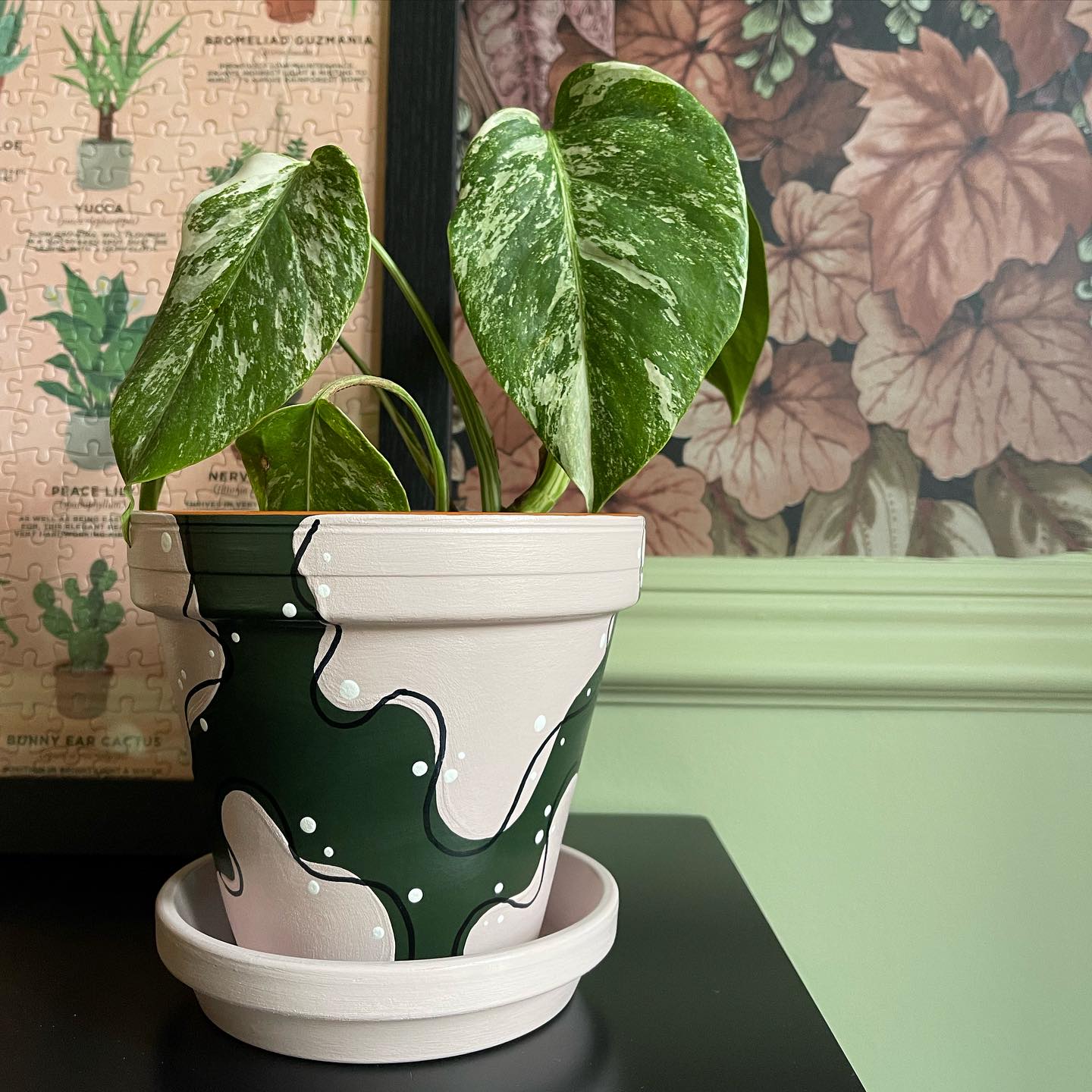
A soft pink base with loose dark green abstract marks has that quality of looking like something you’d find in a design-led homeware shop for considerably more money than it cost to make. The key is keeping the marks gestural and confident — don’t overwork it or it loses the freshness that makes it look good.
The contrast between the painted pot and the marbled plant leaves is doing a lot here. Nature provides the complexity; the pot just needs to provide a sympathetic backdrop. When the plant and the pot feel like they belong together, the whole thing clicks.
13. Floral Folk Art — the Design That Suits Every Skill Level
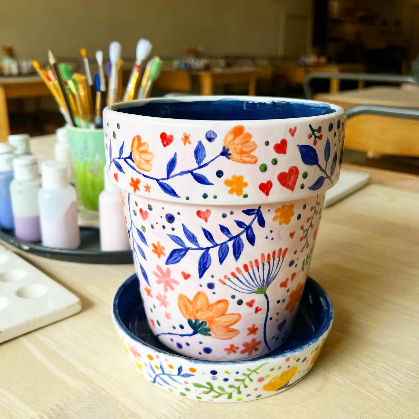
Folk-inspired floral patterns — simple flower heads, small heart details, loose leaf shapes — have been painted onto ceramics for centuries and for good reason. They work at any skill level, they suit terracotta naturally, and the slightly imperfect handmade quality is part of the charm rather than a flaw.
The bold blues and oranges here give it a Central European folk art feel — the kind of design you’d find on traditional Hungarian or Polish pottery. A craft setting with paint and brushes visible makes clear these were made with pleasure, not hurried out. That energy comes through in the finished piece.
14. A Tiny Door Painted on a Pot — the Fairy Garden Approach
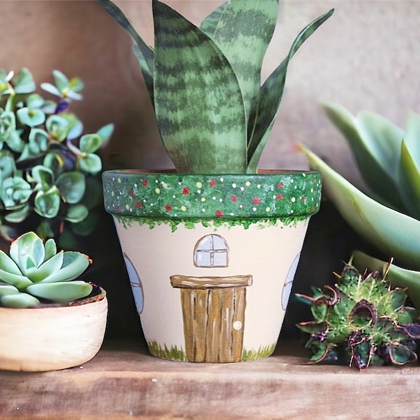
Painting a miniature cottage door complete with windows onto a terracotta pot is one of those ideas that sounds slightly mad until you see it done well, at which point it becomes immediately obvious why people do it. The pot becomes a little world — a house for the plant, a piece of whimsy that makes you look twice.
This approach works especially well among succulents and cacti, where the scale and the textures of the plants amplify the miniature-world effect. It’s an idea that translates beautifully outdoors too — a cluster of pots like this in a garden looks like a tiny village, which is exactly as delightful as it sounds.
15. Swirls and Dots — the Zero-Pressure Paint Approach
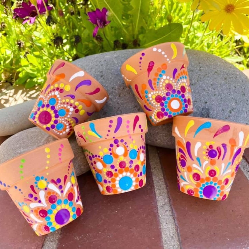
Dots and swirls are arguably the most forgiving pot painting designs because there’s no right or wrong way to do them. Pick two or three colours that work together, load a brush and go. The more relaxed the approach, the better these tend to look — it’s one of those rare design styles where genuine carefree painting is the actual goal.
These small terracotta pots show how much difference paint makes even at a small scale. A plain terracotta pot of this size is almost invisible. These — bright, patterned, full of life — are things you actually want to look at.
16. Animal Illustrations on Pots — the Tropical House Plant Pairing
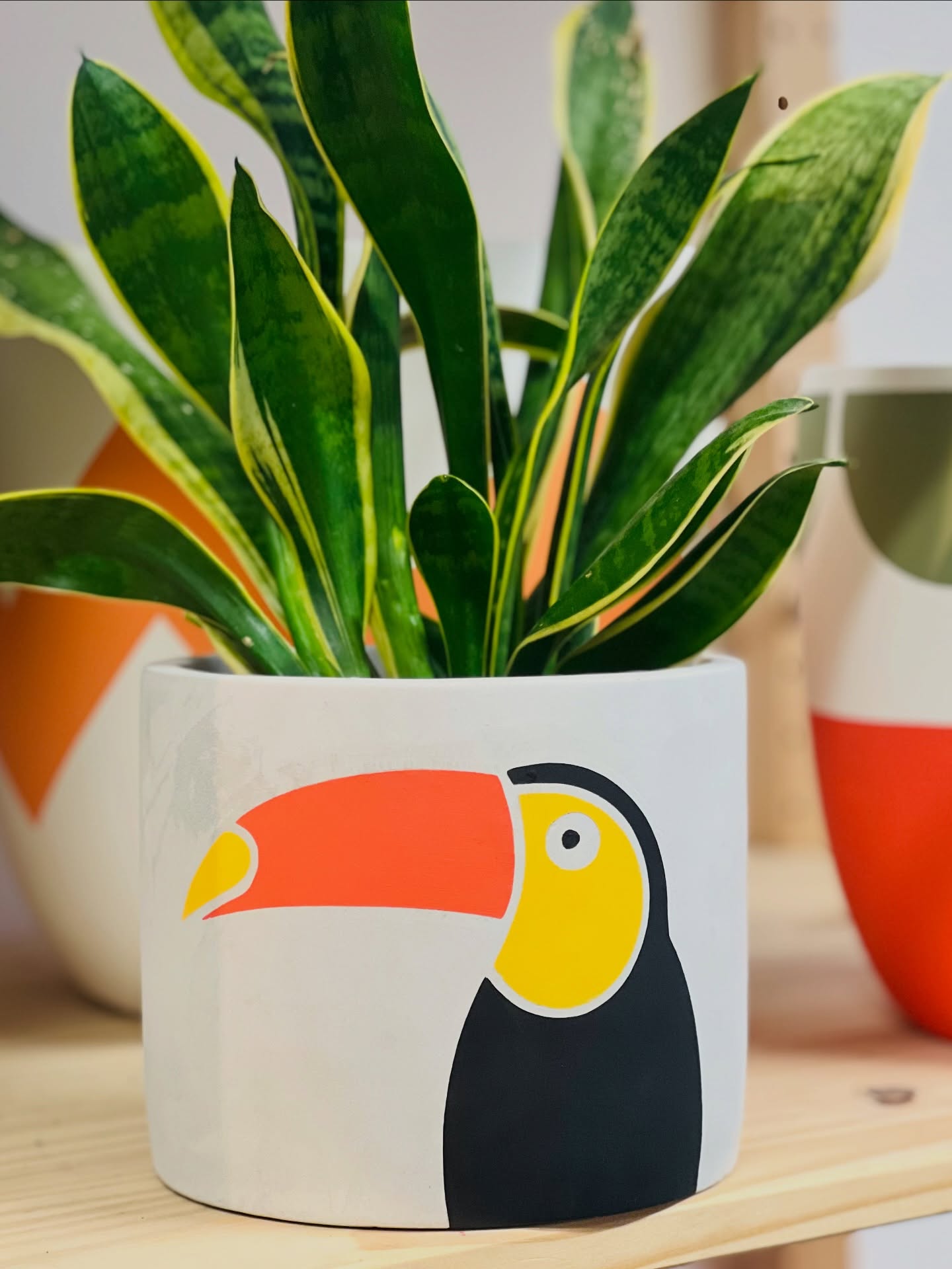
A toucan makes a brilliant subject for a pot because the strong graphic shapes — the bold beak, the clean colour blocks — translate well to a round surface without needing fine detail. The white background keeps it crisp. It’s a design that works as a standalone piece as much as a plant pot.
Tropical plant and tropical bird is a natural pairing, and the variegated leaves shooting up from the pot lean into the theme without any additional effort. If you like this direction, other tropical birds — flamingos, parrots, kingfishers — work equally well and require nothing more than confident, simple shapes.
17. Watermelon Pots You’ll Want to Make Before Summer
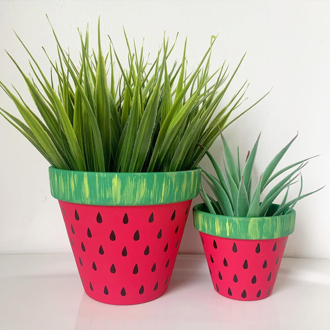
Watermelon pots have become a summer craft staple for good reason — they’re quick to do, striking to look at, and work brilliantly indoors and out. A rich red body, dark seed marks, and a green band near the rim. Most people can achieve this in under an hour, including drying time between coats.
What makes this pairing particularly good is the size variation. A larger pot for a statement plant and a smaller matching one alongside — same design, different scale — creates a set that looks genuinely designed rather than accidental.
18. Hand-Painted Flowers on White Ceramic — the Classic for a Reason
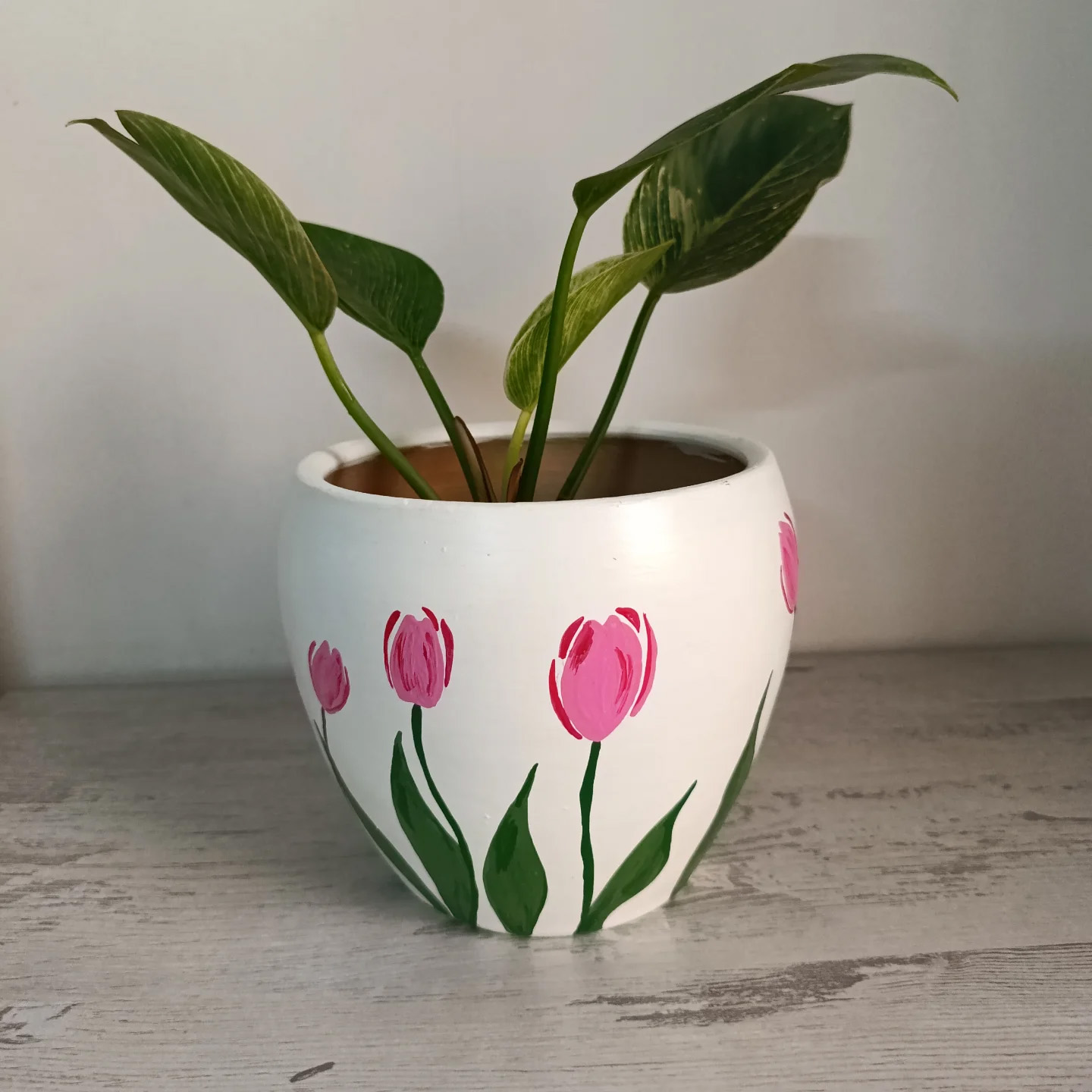
There’s a reason hand-painted florals on white ceramics have never gone out of fashion — they’re genuinely lovely, they suit almost any interior, and they’re much easier to execute than they look. Simple tulip shapes, a few leaves, clean lines. The white ceramic surface is forgiving and the result feels fresh and deliberately crafted.
This is one of those pot painting ideas that also makes a brilliant gift. A white ceramic pot from a pound shop or charity shop, a few hours with some acrylic paint, and you’ve made something that looks boutique. The live plant growing inside makes it feel complete.
19. Abstract Splashes — When You’re Not Sure What to Paint, Just Paint
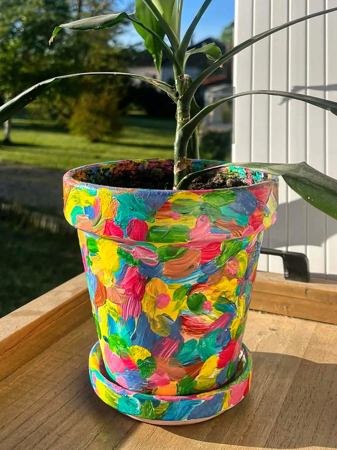
The best thing about abstract pot painting is that the rules don’t exist. Pick colours you like — here it’s blue, pink and yellow — and apply them with whatever energy feels right. Broad strokes, overlapping colour, no plan. The result is always more interesting than a blank terracotta pot and the process is genuinely enjoyable.
Sitting in direct sunlight, the colours here are almost luminous. That’s worth bearing in mind when you’re choosing paint — a pot that lives outdoors in sun deserves colours that can hold their own against it. Go bolder than you think you need to. Colour always reads paler in practice than it looks in the pot.
20. Painted Daisy Pots — the Enduring Appeal of a Simple Flower
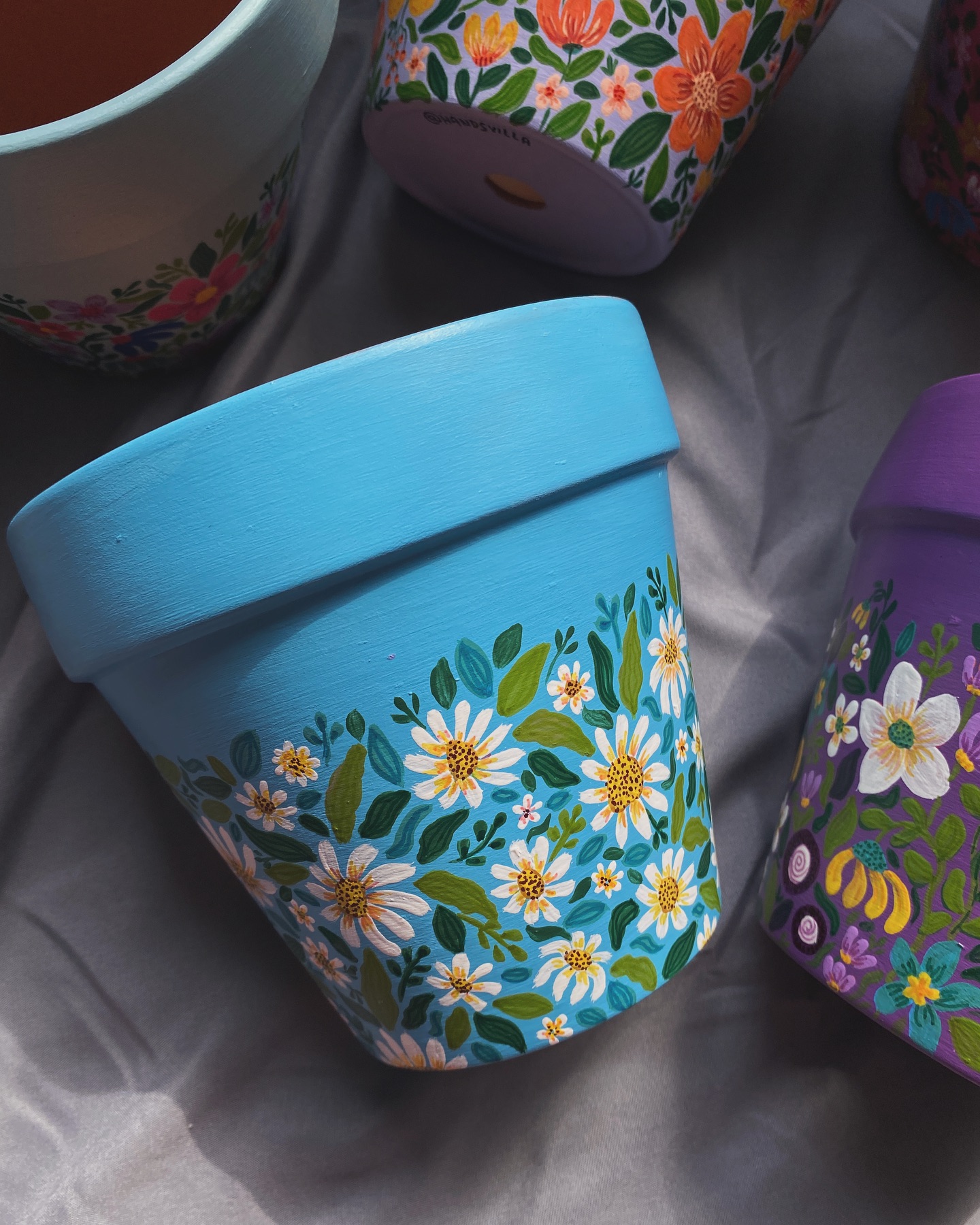
Daisies are one of the most satisfying things to paint on a pot because the shape is forgiving — a circle centre and a ring of petals, repeated — and the result looks cheerful and intentional even when you’re a beginner. A bright blue base makes the white flowers pop immediately. An orange pot with bold orange blooms goes in a completely different direction but lives happily alongside it.
What works about this pair is that they share an energy — handmade, playful, unashamed of their colour — without being identical. That’s the sweet spot with sets of painted pots: related but not matching, coherent but not corporate.
21. A Sleepy Face on a White Pot — the Quiet Charmer
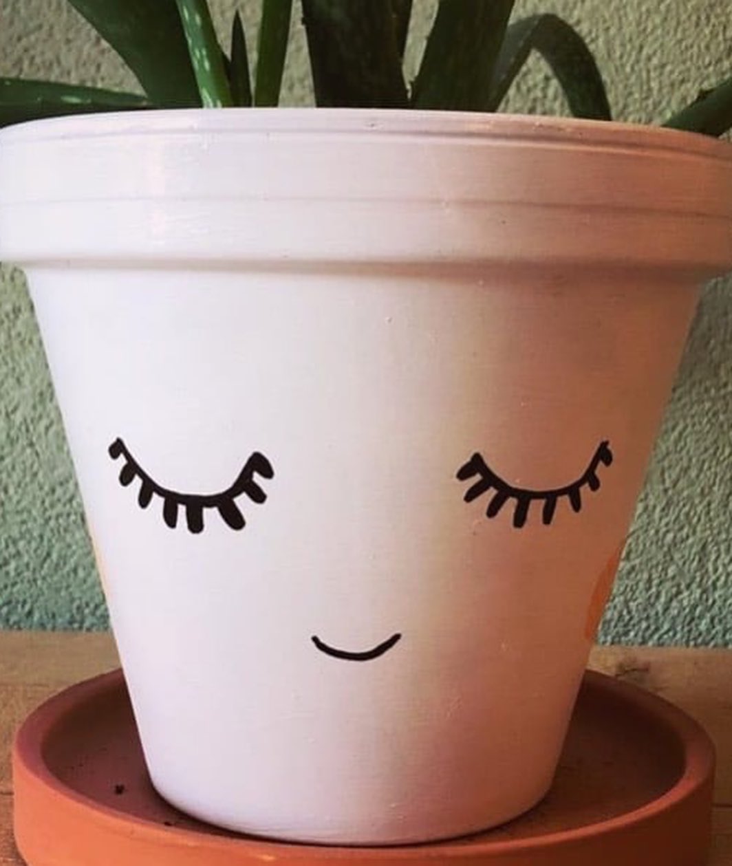
Not every painted pot needs to shout. This one — a simple sleeping face on white, gentle eyelashes, a small smile — has a quieter appeal than the bolder designs. It’s the kind of thing that makes people smile when they notice it rather than the moment they enter the room.
The terracotta saucer underneath is a nice touch — that warm orange against the white pot is a small but effective contrast. If you’re new to painting faces on pots, starting with closed eyes like this is significantly easier than trying to paint open ones and is often more charming anyway.
22. ‘You Grow Girl’ — the Motivational Pot That Actually Works
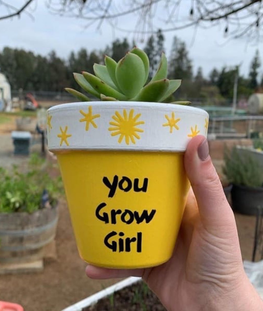
Plant pots with words on them have a habit of feeling a bit cheesy, but this one gets away with it because the bright yellow, the sun and star details, and the genuine affection in the message make it feel warm rather than gimmicky. It’s also a brilliant gift idea — personal, handmade, and considerably more thoughtful than another candle.
The succulent inside is the ideal pairing. Something small, neat, and practically indestructible — a plant that won’t let the message down. If you’re making this as a gift, use a paint pen for the lettering rather than a brush; it’s much easier to get clean, confident letters that way.
23. Bold Leaf Prints on Terracotta — When Nature Paints Itself
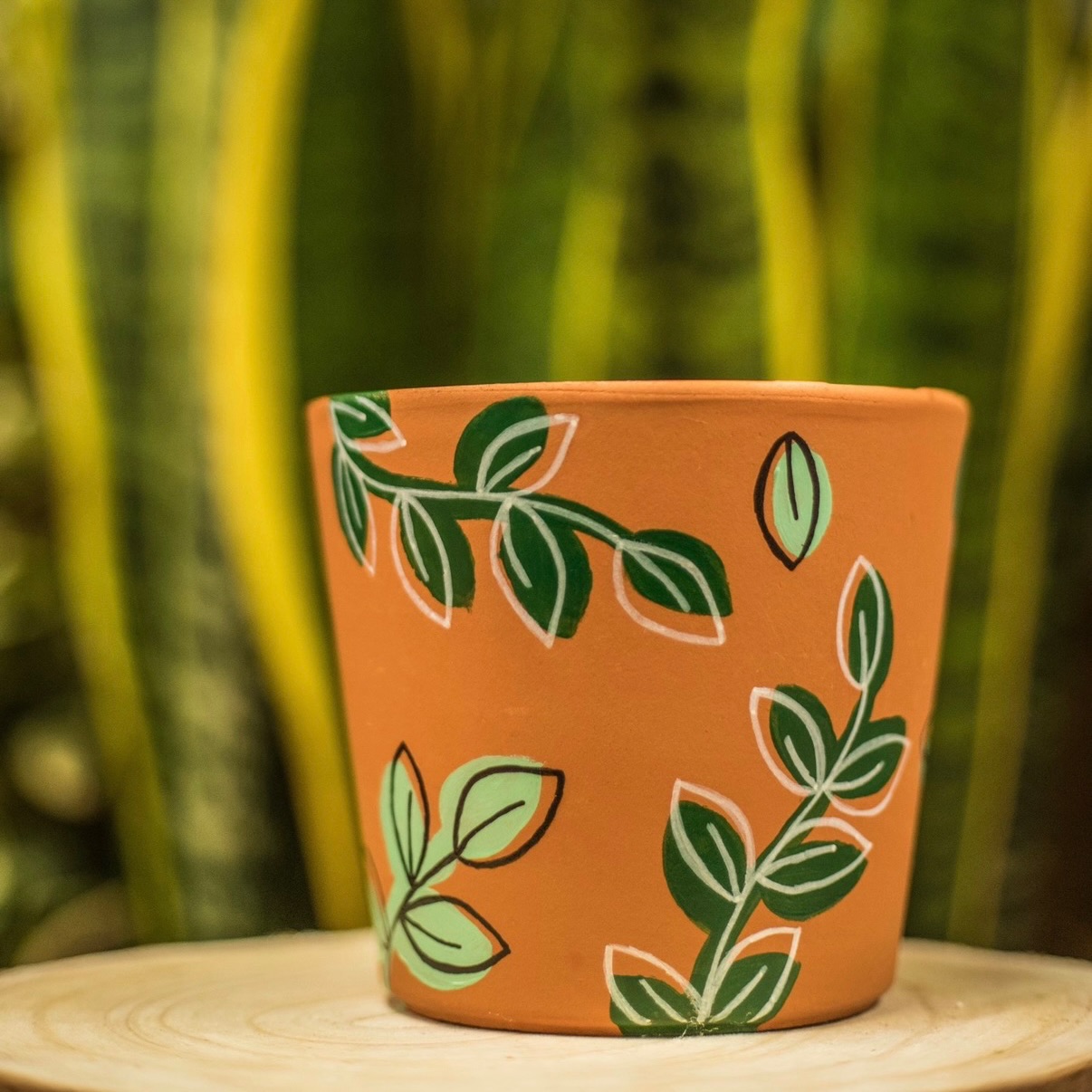
One of the neatest tricks in pot painting is using actual leaves to make the prints — coat a leaf in paint, press it firmly against the pot, peel it away carefully and you’ve got a perfect botanical impression with natural detail no brush could replicate. It’s quick, it’s satisfying, and the result looks genuinely skilled even when it wasn’t.
The warm terracotta base here is exactly the right choice for this design. The earthy clay and the plant-inspired marks are so naturally sympathetic to each other that the pot looks like it was always meant to look this way. A technique worth trying before anything more complicated.